

Raad & Daad offers interim management and executive leadership for manufacturing, wholesale, and logistics companies undergoing change. Whether it concerns an acquisition, merger, reorganization, or strategic reorientation, Raad & Daad provides direction, structure, and results. Additionally, Raad & Daad can bridge temporary capacity gaps at the executive or management level to ensure continuity.
Challenge
The owner of Raad & Daad
Raad & Daad does interim management, executive leadership, bridging temporary capacity problems, and, and, and… The business offers a lot, and that is what makes it great, but on the flipside, it does lose focus in its external communication.
Outcome
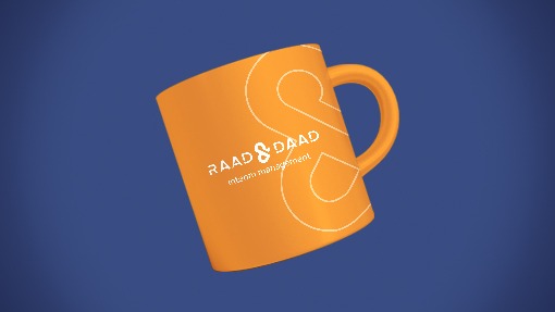
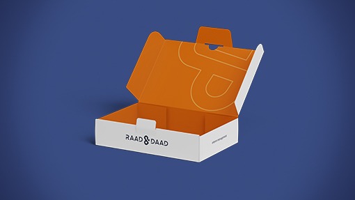
I have built a brand that combines the Dutch down-to-earth mentality with the professional image befitting an interim manager. Instead of ignoring the extent to which Raad & Daad does, I have actually simplified it and focused on it. Now the “and…” is the centrepiece of the brand.
Scope of Project
Logo Design
Identity System Design
My Role


Finding the focus
“During the briefing, I noticed that the entrepreneur combines many things, even when they seem contradictory. For instance, he wanted to show that he is someone who is not afraid to get his hands dirty, but at the same time, he wants to project a professionalism that suits his position and target audience. This is also reflected in the company name, Raad & Daad (council and deed).
These contradictions make it difficult to communicate a focused story to the outside world. Yet I also saw an opportunity in this. Raad & Daad perhaps offers too much, but this is also a strength that deserves to be showcased.
That is why I chose to focus on the ampersand, a punctuation mark that is so beautiful that it is almost a logo in itself. If you look closely, you will notice that the ampersand does not just connect “Raad” and “Daad”, but it contains the “R” and the “D” in itself.
Crafting the logo
The target group was clear beforehand; young people who get behind the wheel on ecstasy. However, it was more difficult to understand the target group, because they come from all kinds of different backgrounds, act and think differently and can be reached in different places. We made a profile sketch to see where and how we can best reach the target group.







Credits
Client
Raad & Daad
Agency
Team Switch
Brand Designer
Jip Laarman
Project Manager
Team Switch
Software & Tools
Adobe Photoshop | Adobe Illustrator | Adobe InDesign